

Web Development
Why Mobile-Friendly Websites Matter
Most of your visitors are on a phone. What mobile-first really means and how it changes design, speed and revenue.
On this page
More than half of web traffic — and most first visits for local businesses — comes from phones. Mobile-friendly is no longer a feature; it is the default environment.
The Numbers That Matter
- The majority of searches for local services happen on mobile
- Google indexes the mobile version of your site first
- Users abandon pages that take more than a few seconds to load on mobile data
What Mobile-Friendly Actually Means
Not "it shrinks." A mobile-friendly site:
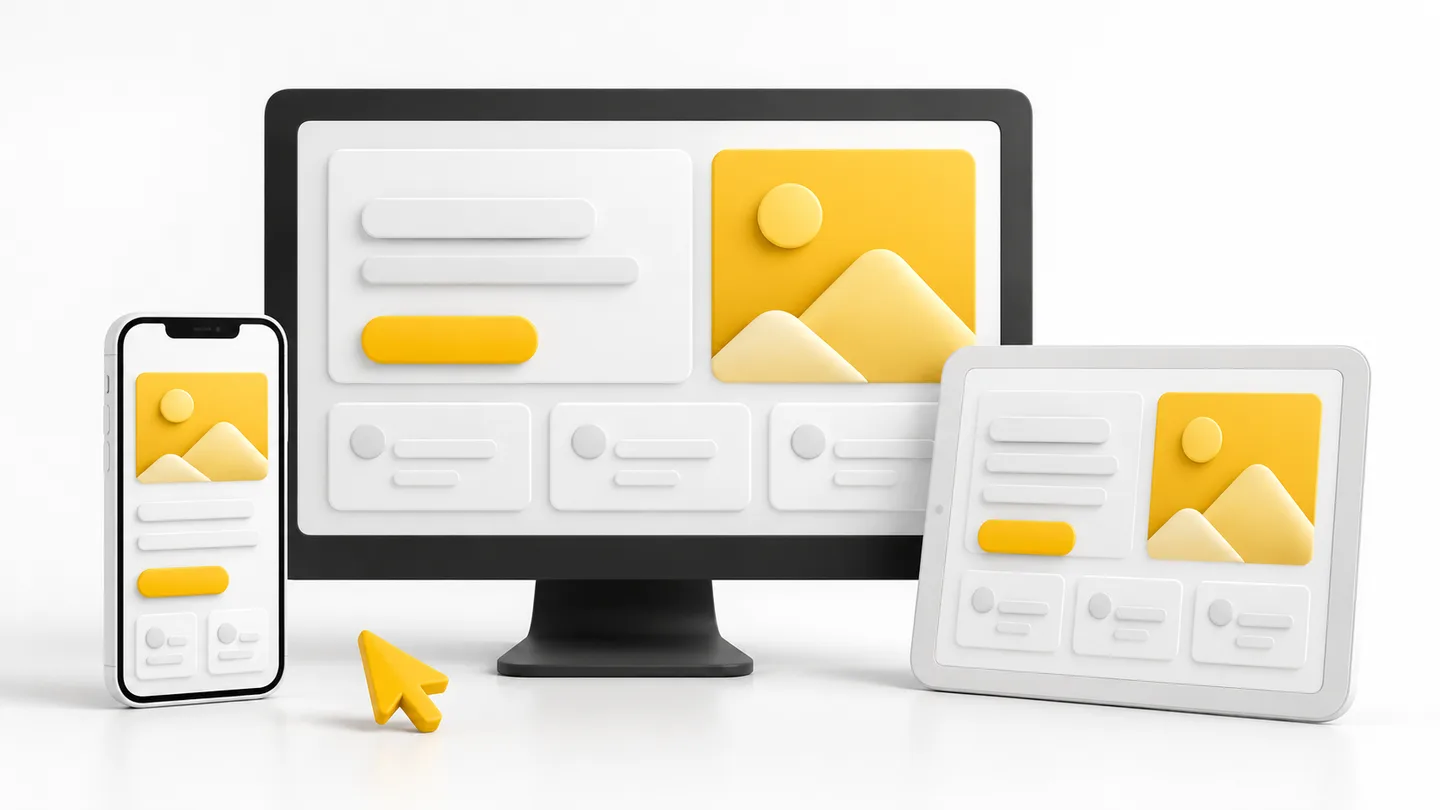
- Reflows — layouts adapt: one column, readable text, no horizontal scrolling
- Resizes — tap targets big enough for thumbs, forms with the right keyboards
- Prioritises — the phone screen shows what the mobile visitor needs first: your offer, your phone number, your WhatsApp button
- Loads fast — compressed images, minimal scripts, real-world data speeds
The Business Impact
Mobile experience directly moves revenue. A restaurant whose menu is a PDF that will not load loses bookings to the competitor whose menu appears in two seconds. A clinic whose "Book" button needs pinch-and-zoom loses appointments.
How to Check Yours
Open your site on a real phone, not just a resized browser window. Then:
- Can you read everything without zooming?
- Can you complete the main action (call, book, buy) with one thumb?
- Does it load in under three seconds on mobile data?
Google's PageSpeed Insights gives you the objective version of the same test.
Design Mobile-First
The best teams design for the phone first, then enhance for desktop. It forces prioritisation — and desktop versions of mobile-first designs always feel more focused. At ArcStack every build is tested on real devices before launch, because that is where your customers already are.
Written by
Thamilnilavan