

UI/UX
Designing Websites for Mobile Users
Thumb zones, one-hand use and prioritisation — how to design for the phone your customers actually hold.
On this page
Mobile-first is not a slogan — it is a design order. Design the phone version first, then let desktop inherit its clarity.
Start From Reality
Your visitor is on a phone, one-handed, possibly walking, connection imperfect. Design for that person, not for a designer's 27-inch monitor.
The Thumb Zone
Reachable matters: primary actions live in the bottom third of the screen. A "Contact" button pinned at the bottom converts better than one hiding in a top menu. Navigation at the very top is for reading, not for the main action.
Size for Fingers
Tap targets at least ~44px. Spaced so a thumb cannot mis-hit. Forms get the right keyboards: numeric for phone, email layout for email. Small targets are the top mobile frustration after speed.
One Column, Strong Hierarchy
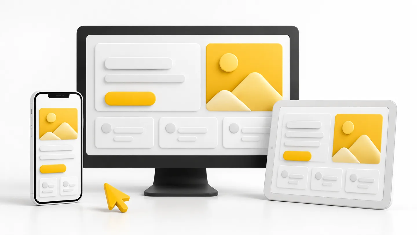
Desktop grids collapse to a single column. Priority must be encoded in order: what the visitor needs first appears first. If everything is important, nothing is.
Ruthless Prioritisation
Mobile has no room for ceremony. Cut secondary navigation, shrink decorative imagery, surface the phone number, WhatsApp button and prices. What you remove is the design.
Performance Is Mobile Design
A beautiful mobile design that loads in six seconds is a failure — most visitors never see it. Compress images aggressively, avoid heavy scripts, and test on a real mid-range phone on mobile data, not on a fast office wifi desktop emulator.
Test Like a Customer
Complete your site's core task on your own phone: find a price, send an enquiry, make a call. Every pinch-zoom, every mis-tap, every wait marks a fix.
Mobile design is prioritisation with pixels. When the phone version is excellent, the desktop version almost designs itself.
Written by
Thamilnilavan